Porsche Tennis Grand Prix. Building a brand beyond the court.
For years, women's tennis was visually dominated by one color: pink.
I wanted to challenge that convention.
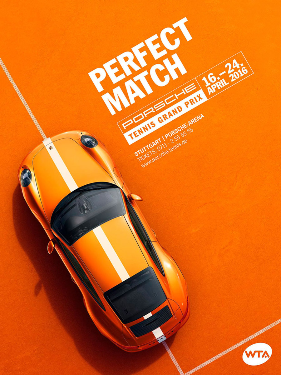
For the Porsche Tennis Grand Prix, I developed a new visual identity built around a bold orange, including a new logo and the key visuals for the 2015–2017 editions. The goal was to establish a distinctive visual code that could become part of the tournament's identity and build recognition over time.
And it did.
The orange look has remained closely associated with the Porsche Tennis Grand Prix ever since, so much so that even the winner's Porsche is finished in orange.

Have an idea? A challenge? Or just a hunch? I'd love to hear it.
The best conversations about brands rarely start with a perfect brief. They start with a question, a problem or simply the feeling that something could be better. So if there's something on your mind, let's talk.
START A CONVERSATION →
Alexander Tibelius
©2026